
Published 5/2026
Statistical Process Control (SPC) charts, or simply control charts, are a foundational tool in Quality Improvement because they allow teams to monitor performance over time. A control chart consists of time-ordered data points, a center line (usually the mean), and upper and lower control limits. Typically, the upper and lower control limits are set at three standard deviations above and below the mean. To construct a control chart, a team first defines how to measure their outcome, collects baseline data, calculates the center line, and determines the control limits. Although the chart elements can be derived manually, available software programs, such as R (https://www.r-project.org/) and Microsoft Excel QI Macros (www.qimacros.com), can be used.
The strength of control charts is their ability to distinguish between common cause and special cause variation. Common cause variation is the natural, expected fluctuation inherent in any system. If one measures performance week to week or month to month, the results will not be the same each time. This normal “scatter” is called common cause variation. In a system that is not well controlled, the results will swing widely. In a more consistent system, the data points will cluster more tightly together. When only common cause variation is present, the process is considered stable or “in control.” Here, fluctuations reflect the underlying design of the process.
Special cause variation, on the other hand, arises from specific or unusual circumstances. It produces an overall change in performance, whether caused intentionally, such as a system improvement intervention, or unintentionally, such as an error or deviation in workflow. Several rules exist to identify special cause variation. A single point falling outside of the control limits or 2 out of 3 points near the control limits identifies a special cause variation that should be investigated. Six consecutive decreasing or increasing data points signal a trend (Figure 11). A shift of 8 or more consecutive points above or below the center line indicates a change in performance, and a new center line and control limits should be set.
Figure 1. Anatomy of a Control Chart.
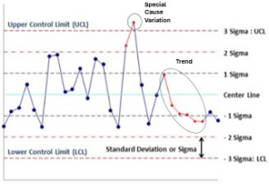
SPC charts help teams avoid overreacting to routine fluctuation (common cause variation) while enabling identification of meaningful change (special cause variation). They support near real-time monitoring, guide appropriate responses to variation, and provide a framework for evaluating whether interventions truly improve system performance.
Example (Figure 2): A hospital’s quality team seeks to improve the rate of Postpartum Hemorrhage (PPH). After collecting baseline data and defining an intervention, in month 10, the team implements universal quantification of blood loss (QBL). As expected, the detection of PPH increases. This is reflected in the control chart by the trend of increasing consecutive points, indicating special cause variation (or the adoption of QBL). The software calculates a new center line and control limits. During months 17-31, the process is in control. In month 32, the quality team begins vetting providers’ willingness to administer a second prophylactic uterotonic to high-risk patients. Data show a new decreasing trend, and the software calculates a new center line and control limits. The data point for month 44 lies outside the confidence limits, representing special cause variation and warrants investigation.
Figure 2. Interventions for Postpartum Hemorrhage

References
1QIMacros. ”Control Chart Cheat Sheet.” www.qimacros.com. Accessed 5.13.26
Additional Resources
- Control Chart – Statistical Process Control Charts | ASQ
- Winckler B, McKenzie S, Lo H-Y. A practical guide to QI data analysis: Run and statistical process control charts. Hosp Pediatr. 2024;14(1):e83-e89. doi:10.1542/hpeds.2023-007296.